Visual Language Week 1: Design Analysis
September 17, 2016 · 376 words · tagged under vislang_fall2016

If a writer knows enough about what he is writing about, he may omit things that he knows. The dignity of movement of an iceberg is due to only one ninth of it being above water. – Hemingway
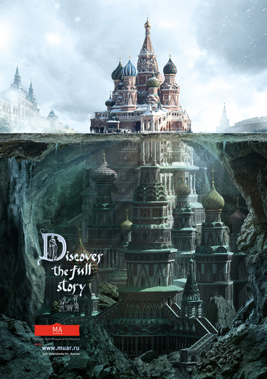
The poster is part of a campaign Saatchi & Saatchi developed for the Schusev State Museum of Architecture in Moscow. The campaign’s goal is to promote the museum’s collection, which reveals lesser known details about historical Russian buildings. The campaign posters employ the familiar “tip of the iceberg” metaphor, imagining vast underground extensions to those historical buildings, to drive home the idea that there’s a whole world of information about those buildings that tourists and locals are not be aware of. The poster I’m focusing on depicts the Saint Basil’s Cathedral, a church in Red Square in Moscow.

Composition
The poster is divided in two parts, the existing, above-surface part and an imagined underground part. The imaginary part far surpasses the existing part in volume, containing more domes and pillars, hinting that the unknown information about the building is far more important significant than what is already known. On the left and right side of the building there are glimpses of the other buildings featured in the museum’s collection.

Colors

The surface part of the poster is dominated by a sky blue color, while the underground part is dark green. The elemental color palette evokes a sense of fantasy and adventure. Whereas the actual church features vividly colored domes, the poster depiction of them is less colorful and saturated, possibly alluding to the church’s more mundane coloring at the time of its consecration.
Typography
The poster is minimal in its use of text, showing just the tagline (“Discover the full story”), the logo of the museum, and some basic information (website, address). The tagline uses a playful script typeface, which along with the illustrations surrounding the tagline, emphasize the historical significance of the building. The museum information, on the other hand, is written with a modern sans-serif typeface, communicating the contemporaneity of the institution.